How a Circular Wheel Redefined Digital Interaction
In the early 2000s, digital music players were a disaster. MP3 players had tiny screens, confusing menus, and clunky buttons that made navigating a few hundred songs feel like trying to dial a phone number while wearing oven mitts.
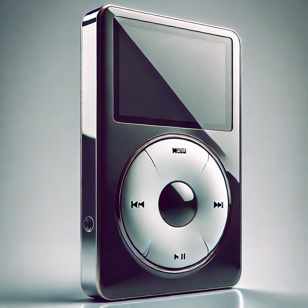
Then, in 2001, Apple released the original iPod. It was sleek, futuristic, and most importantly, it introduced the Click Wheel—a circular touch-sensitive interface that let users scroll effortlessly through thousands of songs. By 2003, Apple had refined the wheel even further, integrating it into the casing itself, making it even simpler and more intuitive.
Why Was the Click Wheel Such a Big Deal?
Before the iPod, navigation on MP3 players was button-based and painfully slow. You had up and down buttons that forced you to click through every song, one at a time. Imagine scrolling through a playlist of 1,000 songs like that. You’d rather carry around a CD wallet and a Discman.
The Click Wheel solved that instantly by introducing circular touch-based scrolling. Users could glide their finger around the wheel, speeding up or slowing down the scrolling motion with a natural, effortless gesture.
It wasn’t just cool—it was objectively faster and more efficient. Suddenly, finding your favorite song took seconds, not minutes.
The Science Behind the Click Wheel’s Genius
Apple didn’t just make a fun little circle to spin. The Click Wheel worked because it was based on fundamental principles of human interaction.
✔ Muscle Memory & Speed:
Humans are naturally better at continuous motions than repetitive clicking. Scrolling with a Click Wheel allowed for fluid movement, making the experience feel more natural and responsive.
✔ Tactile Feedback:
Unlike a touchscreen (which Apple wouldn’t introduce until the iPhone), the Click Wheel had haptic feedback—slight resistance and a satisfying click when pressing down, making interactions feel deliberate and controlled.
✔ Simplicity Over Complexity:
Instead of adding more buttons, Apple removed them. The Click Wheel combined menu navigation, scrolling, and selection into a single input method. Fewer buttons = fewer mistakes.
Why It Destroyed the Competition
Let’s compare the Click Wheel to what other MP3 players were doing at the time:
Creative Zen & early Sony MP3 players – Used tiny joysticks that wore out quickly and made scrolling painfully slow.
Archos MP3 Players – Had clunky physical buttons that required multiple clicks to navigate long playlists.
Microsoft Zune (2006) – Tried to copy Apple’s interface but ended up with a less responsive touchpad that felt awkward and laggy.
The Click Wheel wasn’t just better—it was miles ahead. Apple didn’t follow design trends; they created them.
The Click Wheel’s Legacy
For years, the Click Wheel was Apple’s signature input method. It was featured on the iPod Mini, iPod Nano, and iPod Classic, refining itself with every generation.
But by the late 2000s, the world started moving towards touchscreens. The iPhone (2007) and iPod Touch (2007) changed the game by eliminating physical input altogether.
By 2014, Apple officially discontinued the iPod Classic—the last device to use the Click Wheel. It was the end of an era, but its impact on UX design remains.
What We Can Learn From It Today
Even though we live in a world of touchscreens, gestures, and voice commands, the Click Wheel still holds valuable lessons for modern design:
✔ Simplicity beats complexity.
Instead of adding more features, Apple focused on making the core experience seamless. The best designs don’t force users to think—they just work.
✔ Physical interaction still matters.
The best interfaces have some kind of physical feedback. Whether it’s the haptic vibrations on a phone or the click of a mechanical keyboard, users appreciate interfaces that feel tactile and responsive.
✔ Good UX is timeless.
Even though the Click Wheel is no longer used, its design principles still influence how we interact with technology today. The smooth scrolling of a MacBook’s trackpad, the dial on a smartwatch, even the way we flick through a touchscreen interface—all of these concepts owe something to the Click Wheel.
Final Verdict
The iPod Click Wheel wasn’t just a cool feature—it was a UX revolution. It transformed how we interacted with digital content, setting a standard that influences design decisions even today.
RIP, Click Wheel. You were ahead of your time.