The Web Wasn’t Ready for Mobile
It’s 2006. Flip phones are everywhere. The Motorola Razr is king. The first iPhone? Hasn’t even been announced yet.
Most people still browse the web from a desktop or a chunky laptop. But something is changing. People are starting to browse on mobile devices. The problem? The web isn’t built for small screens.
Back in the early 2000s, web designers assumed that everyone was using a 1024×768 resolution screen. Websites were designed with fixed widths—typically 960 pixels wide, centered, and optimized for desktop monitors. That was fine… until smaller screens came into play.
Now, if you try opening a website on a phone, it’s a nightmare. You have to scroll sideways, pinch to zoom, and deal with broken layouts that don’t adjust. Some sites load massive images that slow everything down. Others just don’t load properly at all.
The Current “Solutions” (And Why They have to change)
With more people trying to browse on mobile, companies are desperate to make their sites work across different devices. Here’s how they’re doing it—and why none of these solutions actually work.
❌ 1. Creating a Separate Mobile Website (m.website.com)
Some companies build two separate websites—one for desktops (www.website.com) and one for mobile (m.website.com). If you visit the site from a phone, it automatically redirects you to the mobile-friendly version.
Sounds smart, right? Nope.
Problems:
Double the work—Every time the desktop site updates, you have to update the mobile version separately.
Bad for SEO—Search engines see two versions of the same site, which can hurt rankings.
Inconsistent experience—The mobile site is usually a stripped-down version with fewer features. Users don’t get the full experience.
❌ 2. Ignoring Mobile Users Altogether
Other companies just… don’t do anything. They assume users will zoom and scroll manually if they want to read their site.
Problems:
Frustrating to use—Nobody wants to zoom in and out just to read a paragraph.
Navigation is impossible—Tiny buttons and menus weren’t designed for touchscreens.
Users leave immediately—If a site is too painful to use, people go somewhere else.
Neither of these approaches is sustainable. The web needs a new solution.
—
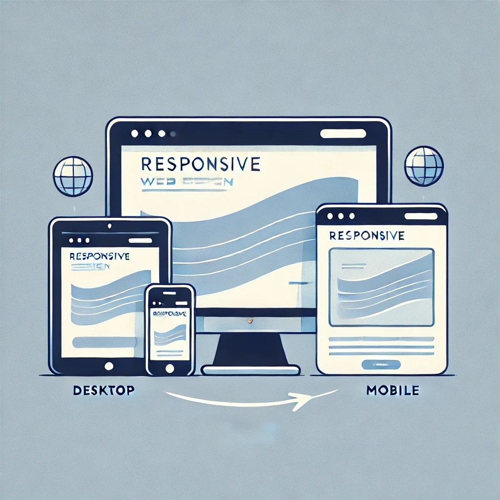
The Idea of Responsive Web Design
A small group of designers is rethinking web layouts entirely. Instead of building two versions of a site, what if a single website could automatically adjust itself based on the screen size?
That’s the core idea behind responsive design—a flexible approach that lets websites adapt to different devices without needing a separate mobile version.
Here’s how it works:
✅ 1. Fluid Grids Instead of Fixed Widths
Instead of designing websites with fixed pixel dimensions, designers are starting to use fluid grids—layouts that resize dynamically based on the screen size.
💡 Old way: A sidebar is 300 pixels wide, no matter what.
💡 New way: A sidebar takes up 30% of the screen width, no matter what the screen size is.
✅ 2. Flexible Images That Resize Automatically
Right now, if you load a website on a mobile phone, images often appear way too big—forcing users to scroll sideways. With responsive design, images resize proportionally so they fit neatly within the layout.
✅ 3. CSS Media Queries: The Secret Weapon
The most exciting innovation? CSS media queries.
💡 What they do: They let designers apply different styles depending on the screen size.
For example:
If the screen is larger than 1024px, show a desktop layout.
If the screen is between 768px and 1024px, switch to a tablet-friendly layout.
If the screen is smaller than 480px, adjust everything for mobile.
This means one website can work on multiple devices—without needing a second version.
—
Who’s Using This Right Now?
As of 2006, responsive design is still a new concept. Some designers are experimenting with it, but most companies haven’t caught on yet.
A few early adopters are already playing with fluid grids and flexible layouts, but there’s no universal name for this approach yet. In fact, the term “Responsive Web Design” hasn’t even been coined yet!
It won’t be until 2010, when designer Ethan Marcotte officially names it, that the industry fully embraces it. But even today, the foundations are being laid.
—
What’s Next?
Right now, mobile internet usage is still small—but it’s growing. Devices are getting better, and mobile web browsing isn’t going away. If companies don’t start thinking about flexible, adaptive web design, they’ll fall behind.
What This Means for the Future of Web Design
🚀 Building two separate websites (desktop + mobile) won’t be sustainable.
🚀 Designing with fixed widths is already outdated.
🚀 Websites that don’t adapt to different screen sizes will lose users.
It’s only a matter of time before responsive design becomes the new standard.
Right now, most of the internet is stuck in the fixed-layout era. But a change is coming. And in a few years, no one will be designing websites the old way.
—
Final Thoughts
This new idea of adaptive, flexible web design isn’t mainstream yet. Most companies haven’t realized the problem exists, and mobile traffic is still too small for them to care.
But in a few years? It’ll be impossible to ignore. Websites that don’t adapt will feel as outdated as a brick-sized Nokia phone.
And those who embrace this shift early will be ahead of the curve.