A Blank Page That Redefined Search
In the early 2000s, web design was a chaotic mess. Homepages were stuffed with links, cluttered sidebars, flashing banners, and an overwhelming amount of distractions. The dominant players—Yahoo!, MSN, and AOL—operated under one assumption: more content = more engagement.
Then, there was Google. A company that took a completely different approach.
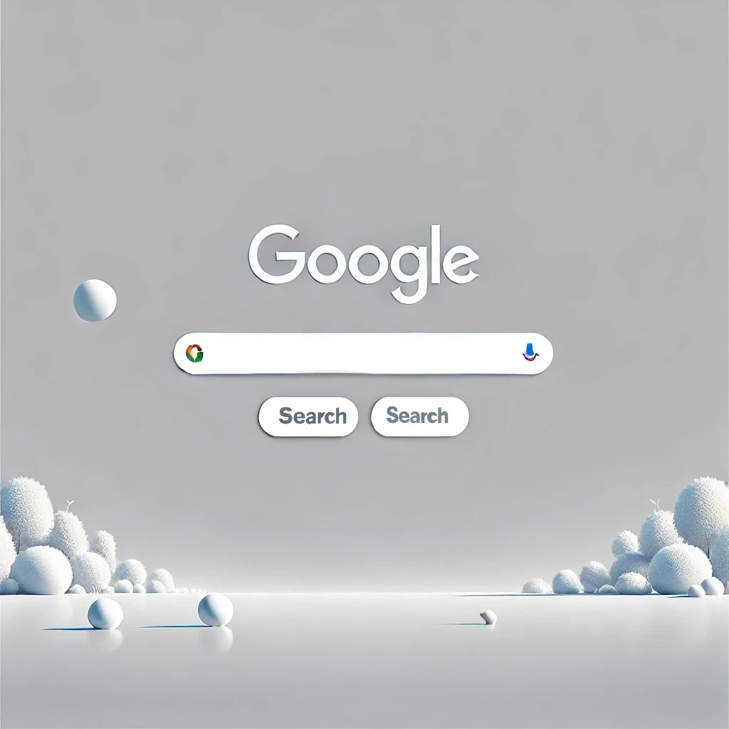
When you landed on Google.com in 2005, you saw a blank page, a centered logo, and a search bar. That’s it. No stock tickers, no news articles, no weather updates. Just a space for users to type what they were looking for and hit enter.
It was a radical departure from the norm. And it changed the internet forever.
Why Did Google’s Minimalist Homepage Work?
At a time when every other search engine was bloated with distractions, Google’s homepage felt like a breath of fresh air. But the simplicity wasn’t just about aesthetics—it was a strategic masterstroke.
1. It Put the User First
Yahoo! and MSN treated their homepages like portals, assuming users wanted to browse through curated content. Google understood something different:
🚀 Users didn’t want to browse—they wanted to find.
By stripping away everything unnecessary, Google forced users to do just one thing: search. And that laser focus on search made users trust Google’s results more than anyone else’s.
2. It Made Search Lightning Fast
While Yahoo! and MSN pages took forever to load (especially on slow dial-up connections), Google’s homepage was so lightweight it loaded almost instantly.
💡 Faster page load = better user experience.
This wasn’t an accident. Google’s entire brand revolved around speed—fast search results, fast indexing, fast everything. Keeping the homepage minimal was part of a bigger strategy to make sure users never had to wait.
3. It Felt More Trustworthy
Imagine you’re looking for an answer to an important question. You land on a website and it’s filled with ads, irrelevant content, and distractions. Do you trust that website’s information? Probably not.
Now imagine you land on a clean, focused page with just a search box. It feels more authoritative, more direct, more honest.
This is exactly why Google became the default search engine for millions of people.
Google’s Simplicity Wasn’t an Accident
A lot of people assume Google’s homepage was minimalist by chance, but that’s far from the truth.
Legend has it that Larry Page and Sergey Brin weren’t great at web design—they kept the homepage blank because they didn’t know how to code anything more complex.
But even as Google hired the best designers in the world, they stuck to the simple layout. Why? Because it worked.
Google’s core philosophy was:
🔹 Focus on the user, and everything else will follow.
🔹 Remove anything that doesn’t add value.
🔹 Make it fast, make it clean, make it useful.
The Long-Term Impact of Google’s Minimalist Design
The ripple effects of Google’s homepage decision were felt across the entire internet.
1. The Death of the Overcrowded Homepage
After years of trying to throw everything onto their homepages, competitors had to rethink their approach. Yahoo! eventually started simplifying its interface, but it was too late—Google had already become the go-to search engine.
2. The Rise of Clean, Functional UI
Google’s homepage inspired a shift toward simpler, cleaner web design. Over the years, we’ve seen:
✔ Minimalist interfaces in mobile apps (think Instagram’s early design).
✔ E-commerce sites prioritizing search and simplicity.
✔ A move away from cluttered dashboards and overcomplicated UI elements.
3. A New Standard for Speed & Performance
Google’s obsession with fast loading speeds changed web development forever. Today, companies know that:
🚀 A slow website = lost users.
🚀 Clean code = better performance.
🚀 Minimal design = better user engagement.
What Can We Learn From This Today?
Google’s homepage isn’t just a relic of web history—it’s a masterclass in UX and strategy.
✔ Users crave simplicity. If you make things complex, they’ll go somewhere else.
✔ Speed matters. A slow experience kills engagement, no matter how “pretty” a design is.
✔ Less is more. Focus on what users actually need, not what you think they want.
In a world where companies constantly overcomplicate design, Google’s homepage remains the gold standard of simplicity done right