How Realistic Icons Gave Way to Minimalism
Back in the early 2000s, digital interfaces were obsessed with mimicking the real world. Your notes app looked like a real notepad, complete with lined paper and a leather cover. Calculator apps had fake glossy buttons that simulated the feel of a physical device. Even the trash bin on your desktop looked like… well, an actual trash bin.
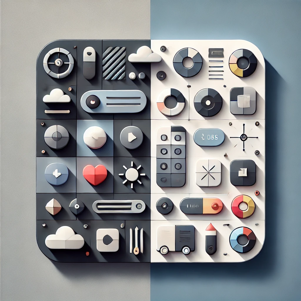
This was skeuomorphism—a design philosophy that made digital elements look and behave like their real-world counterparts to help users feel at home in the digital space. The idea was simple: If it looks familiar, people will know how to use it.
And for a while, it worked. Skeuomorphic design dominated the early 2000s, from Apple’s Mac OS X to Windows XP’s bubbly, glass-like interface. But by the mid-2000s, designers started questioning its long-term value. Was making a digital bookshelf look like a wooden one really necessary? Were all these textures, gradients, and shadows adding usability—or just clutter?
The Rise of Flat Design
By 2010, digital interfaces had evolved. Screens were higher resolution, touchscreens were the norm, and users had become more comfortable with digital navigation. The need for hyper-realistic designs started to fade.
This shift led to the rise of flat design—a style that eliminated unnecessary textures, shadows, and realistic details in favor of clean shapes, bright colors, and crisp typography. Google, Apple, and Microsoft all began transitioning away from skeuomorphism, opting for simpler, more modern interfaces.
Key Differences Between Skeuomorphism & Flat Design
✔ Skeuomorphism uses textures, drop shadows, and lighting effects to mimic real-world objects.
✔ Flat design eliminates unnecessary details, relying on color, contrast, and typography for usability.
✔ Skeuomorphic UI is visually rich but can be cluttered.
✔ Flat UI is clean, minimal, and scalable across devices.
Why Skeuomorphism Died
Skeuomorphism wasn’t bad—it just wasn’t built for the future. It had a few fatal flaws:
1. It Didn’t Scale Well
When smartphones and tablets started taking over, skeuomorphic interfaces became a nightmare to scale. Buttons that looked great on a desktop looked bloated on a small screen.
2. It Slowed Down Users
All the fancy gradients and shadows added visual noise that distracted users. Flat design reduced cognitive load, making navigation faster and more intuitive.
3. It Looked Outdated
By the early 2010s, s keuomorphism started looking old-fashioned—like wearing baggy jeans from the 90s in 2012. Companies wanted their interfaces to feel modern and timeless.
Microsoft & Google Led the Flat Design Revolution
Surprisingly, it wasn’t Apple that first embraced flat design—it was Microsoft. In 2010, Windows Phone introduced Metro UI, an interface built around bold typography, clean layouts, and flat icons. It was a radical departure from skeuomorphism.
Google followed suit with Material Design in 2014, which introduced a flat design system with subtle depth and motion. Apple, the company that made skeuomorphism famous, fully abandoned it in 2013 with iOS 7, switching to a flat, minimalist aesthetic.
Did Skeuomorphism Completely Disappear?
Not entirely. While full-fledged skeuomorphic design is gone, some of its ideas still exist. Today’s design blends flat aesthetics with subtle depth, gradients, and shadows—a concept sometimes called “Neumorphism” or “Soft UI.”
What This Shift Teaches Us
✔ Design must evolve with technology. What worked in 2004 looked outdated in 2014.
✔ Minimalism often beats over-design. Less clutter = faster, smoother experiences.
✔ Trends always cycle back. Who knows? Skeuomorphism might return in some form in the next decade.
Flat design wasn’t just a trend—it was a necessary step forward in digital design. The death of skeuomorphism wasn’t the end of realism in UI—it was the beginning of a smarter, more adaptable digital future.